My Role
Researcher, Reporter, Designer
My Team
Ziyad Bulbulia, Daniel Lionti, Rachel Su, Vraj Dudhatra
Process
User Interviews, Research Synthesis, Ideation, Wireframe, Prototype, User Testing, Iteration
Tools
Figma, Mural, Personas, User Flows, UserTesting.com
Timeline
13 Weeks
In our academic capstone project, mentored by TipTap creator Chris Greenfield, our team was assigned the challenge of devising a digital solution for visitors to his latest endeavor, "ThePark" — a members-only park and recreation site. Our objective was to develop a digital product that elevates the member experience. While we had complete creative freedom in designing features, our primary requirements included implementing a check-in/out system for members, facilitating event promotion and offering park information to visitors.
For optimal viewing experience, click the full screen icon in the top right corner > click “Options” in the top right corner > “Fit - Scale Down to Fit”.
Please note that not all functions have been programmed.
The Process
Discover ➝ Define ➝ Develop
DISCOVER
User Research
In order to gain deeper insight into our users' needs, we conducted interviews with individuals who engage in outdoor activities and regularly visit parks or conservation areas. Each interview was then transcribed and integrated into a synthesis canvas on Mural. The interviews were analyzed, generating a series of insights and user needs. These findings guided the refinement of our user flow and personas.
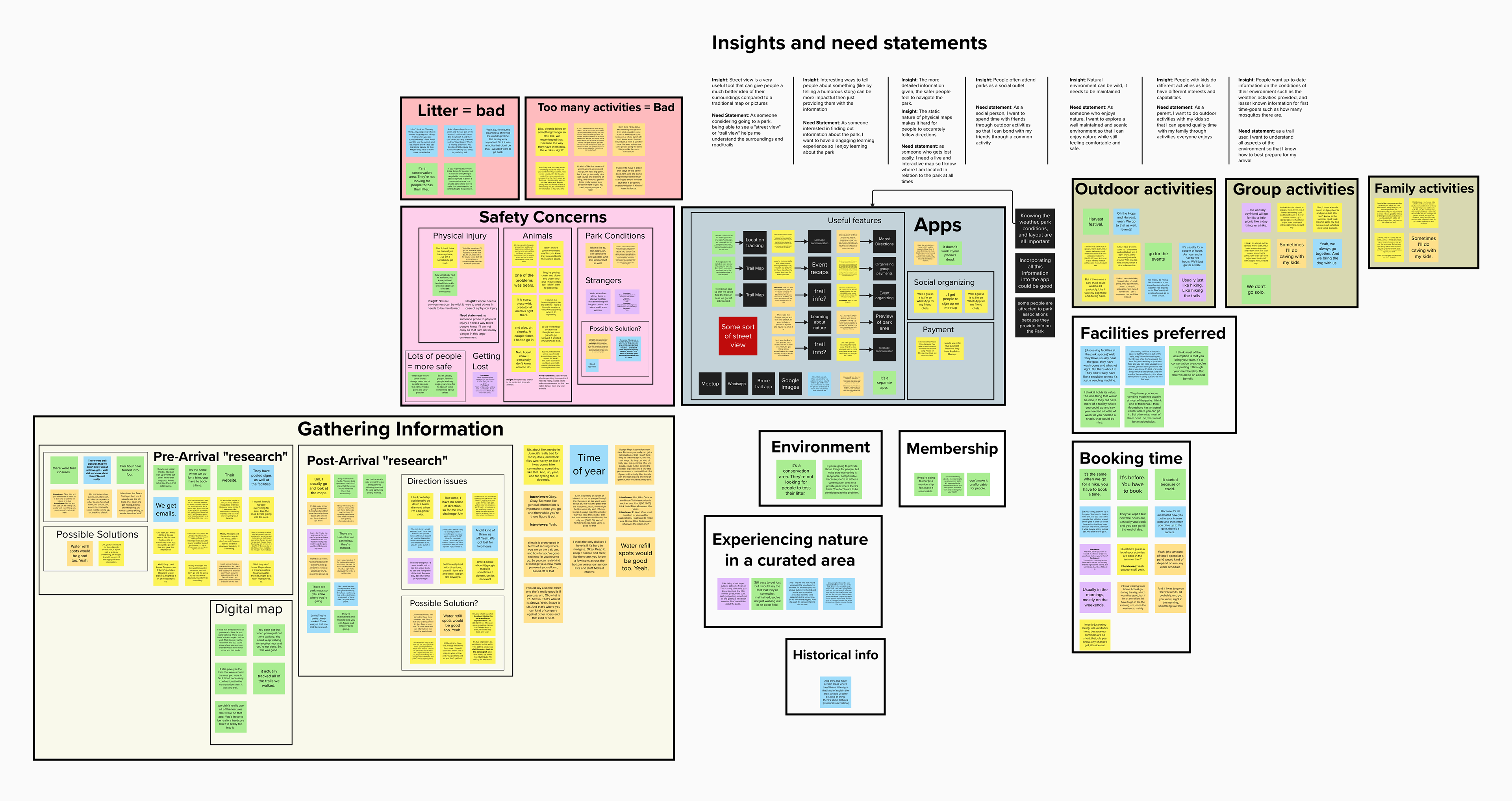
Research Findings
Participants primarily used their phones for navigation, accessing park/trail info, and taking photos. They gathered park info from websites, emails, group chats, or at the park.
Safety concerns included getting lost, encountering wildlife or strangers, injuries, or unsafe conditions. Suggestions included providing a contact number and allowing visitors to share photos or location details.
All participants belonged to at least one park or conservation area, providing insights on membership preferences and issues. Some wanted more food options beyond vending machines, while others stressed clean trails. The cost of the membership was also a common concern.
Participants used static maps or separate apps for navigation, facing challenges like closed trails or complex apps. Desired features included comprehensive trail info and real-time tracking.
The insights gathered during the research phase of this project were incredibly valuable, guiding us in identifying the necessary features for our digital product. This enabled us to develop a medium-fidelity prototype that closely aligns with user needs and preferences.
DEFINE
People Problem
How can we optimize visitor experiences to ensure they have the most seamless and safest visit possible?
User Story
I seek a solution that streamlines activity planning, offers trail discovery, provides real-time alerts, and fosters connections with fellow visitors, tailored to my interests for an enhanced park experience.
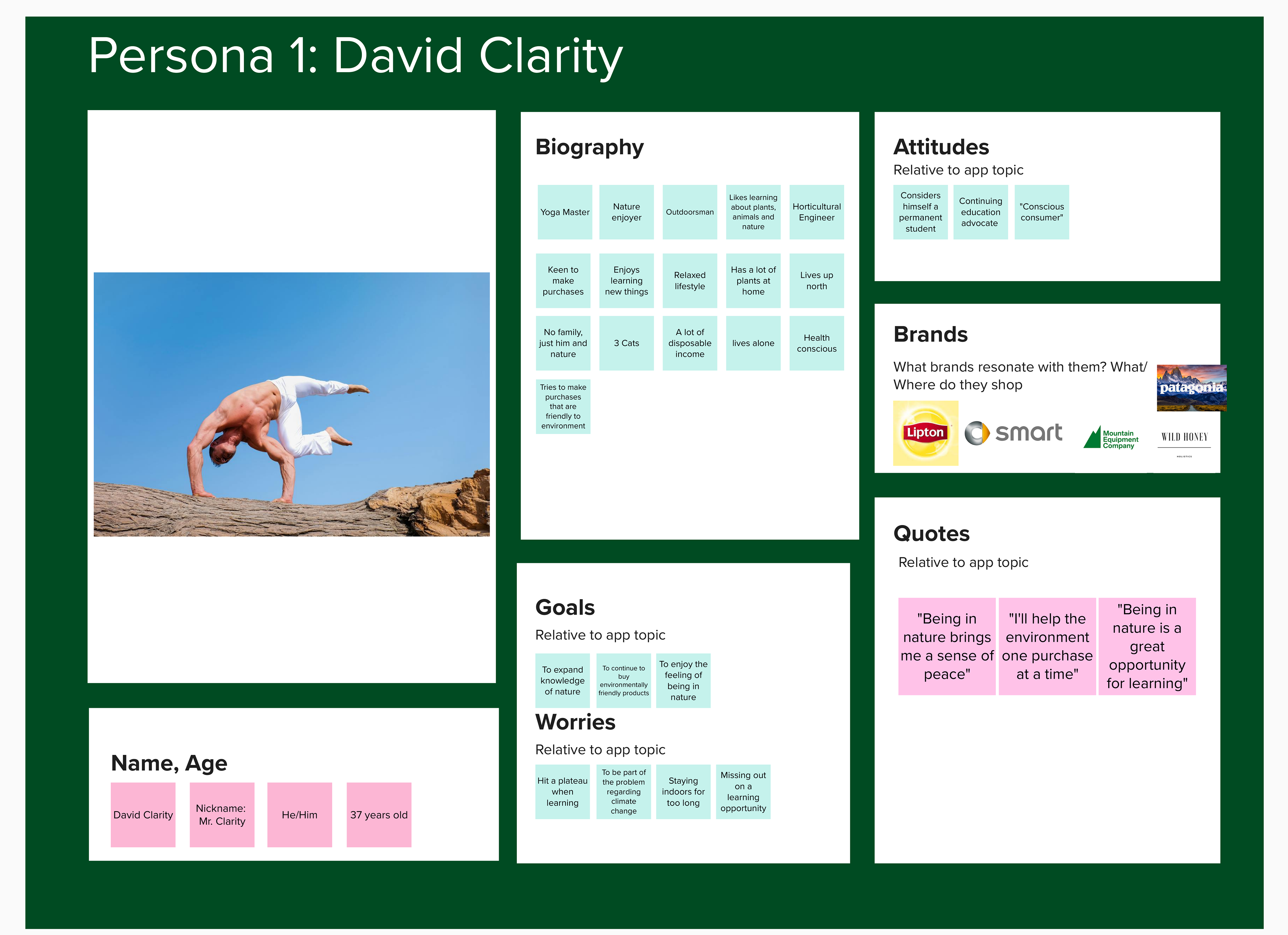
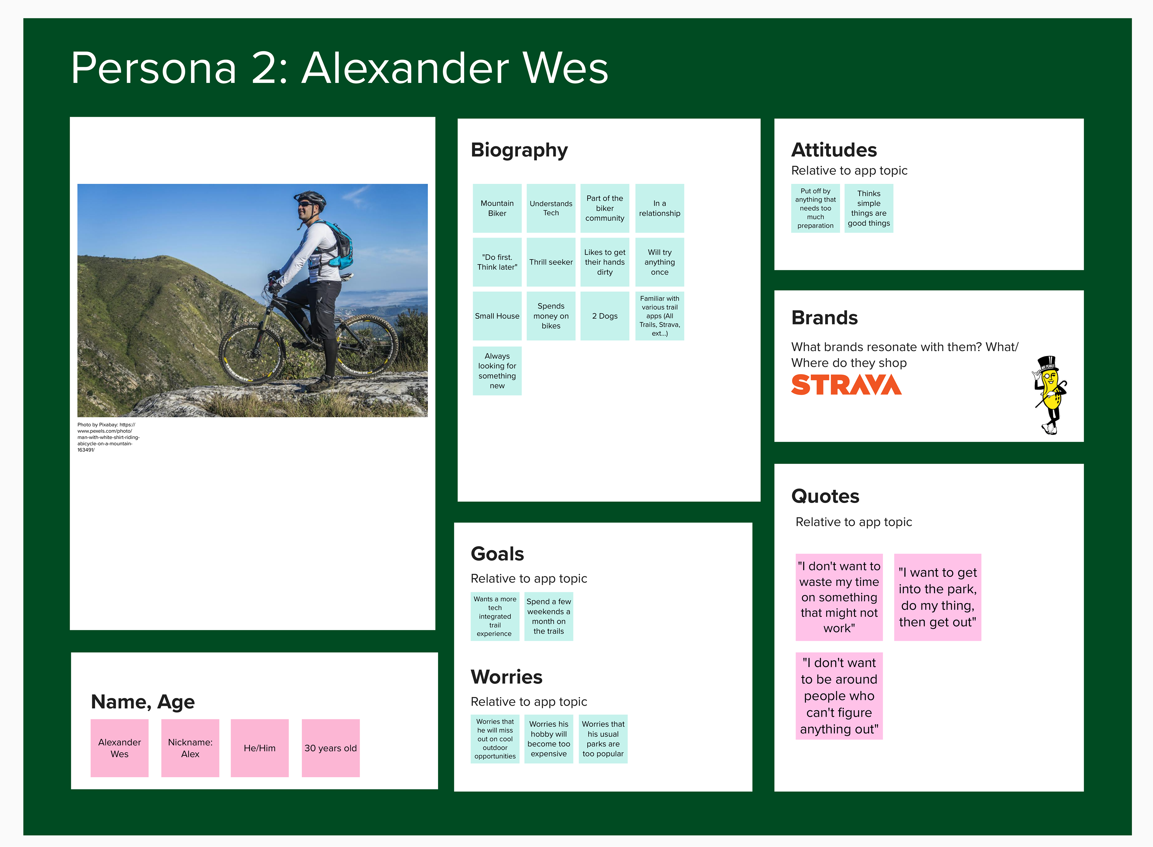
Personas
We crafted personas derived from insights and user needs identified in our affinity map. These personas included a 30-year-old seeking efficient trail research and a nature enthusiast interested in discovering handmade goods.
DEVELOP
User Flow
In response to the personas’ requirements, we devised a user flow to structure the user experience for our wireframe prototypes.
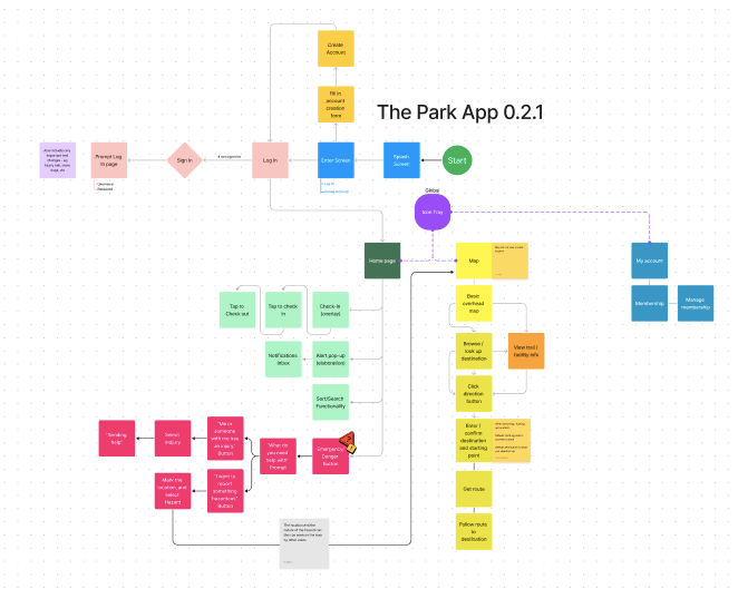
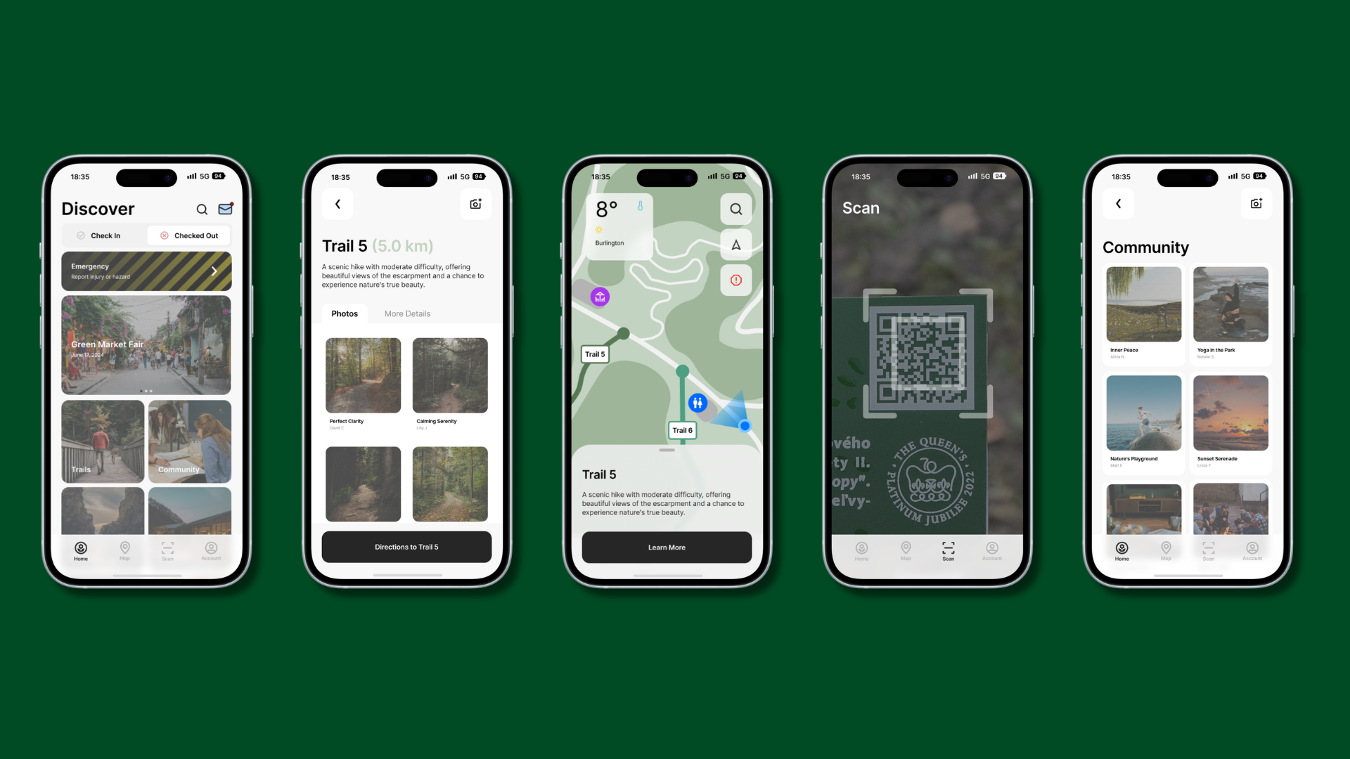
Wireframes
The first set of wireframes were crafted based on the user flow and presented for feedback. The insights gained from feedback sessions guided iterative adjustments to the wireframes. Upon completion, the wireframes were transformed into a functional prototype. This protoype was then used to gain insights from user testing.
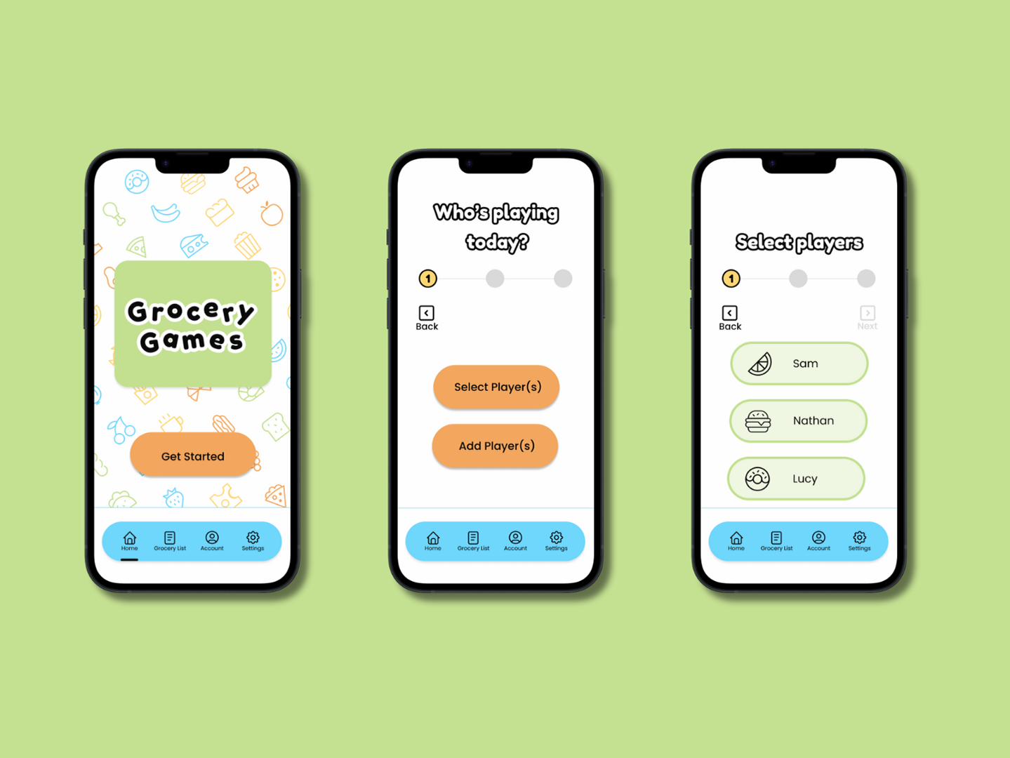
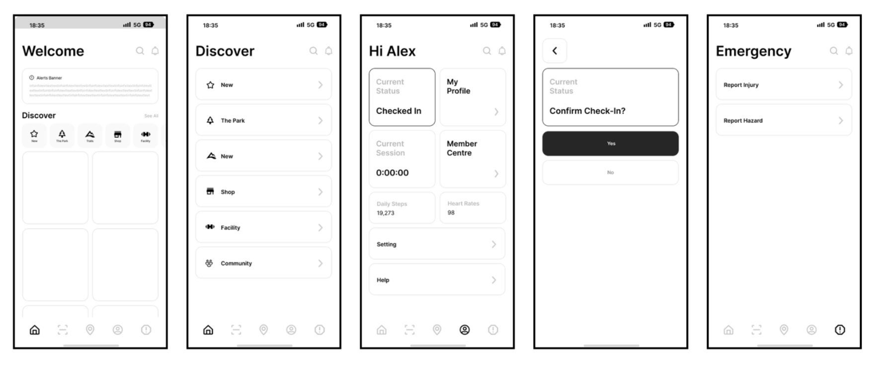
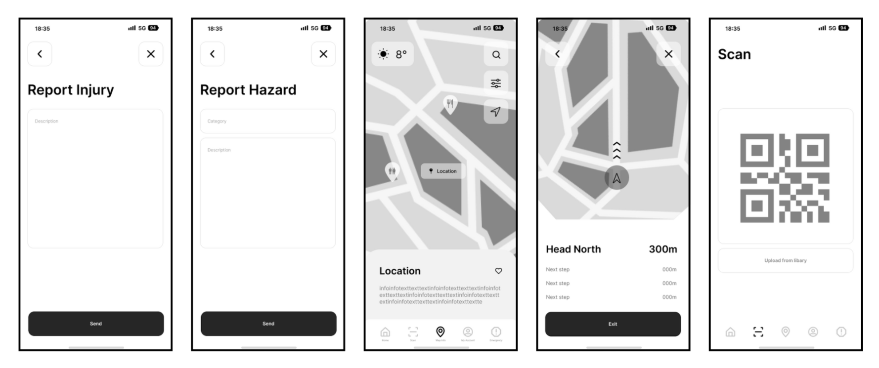
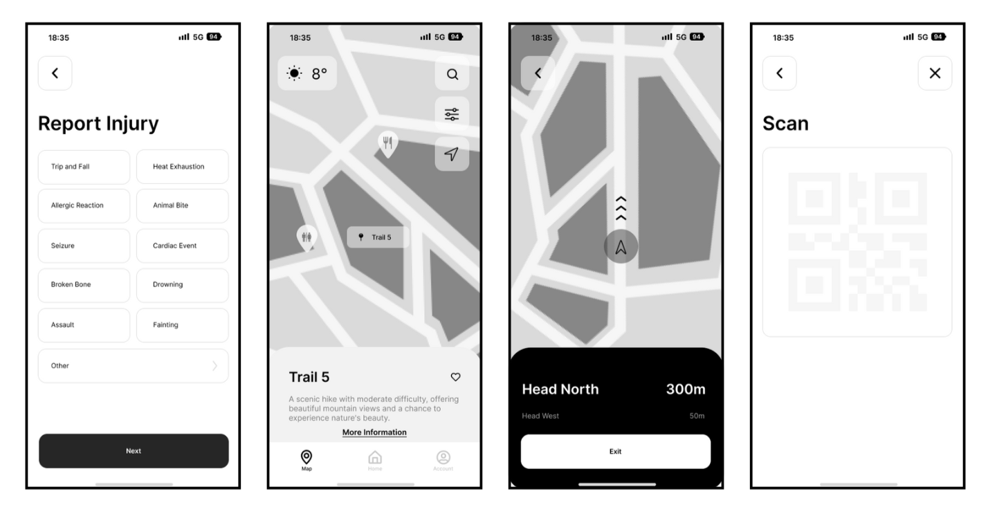
Wireframes V1
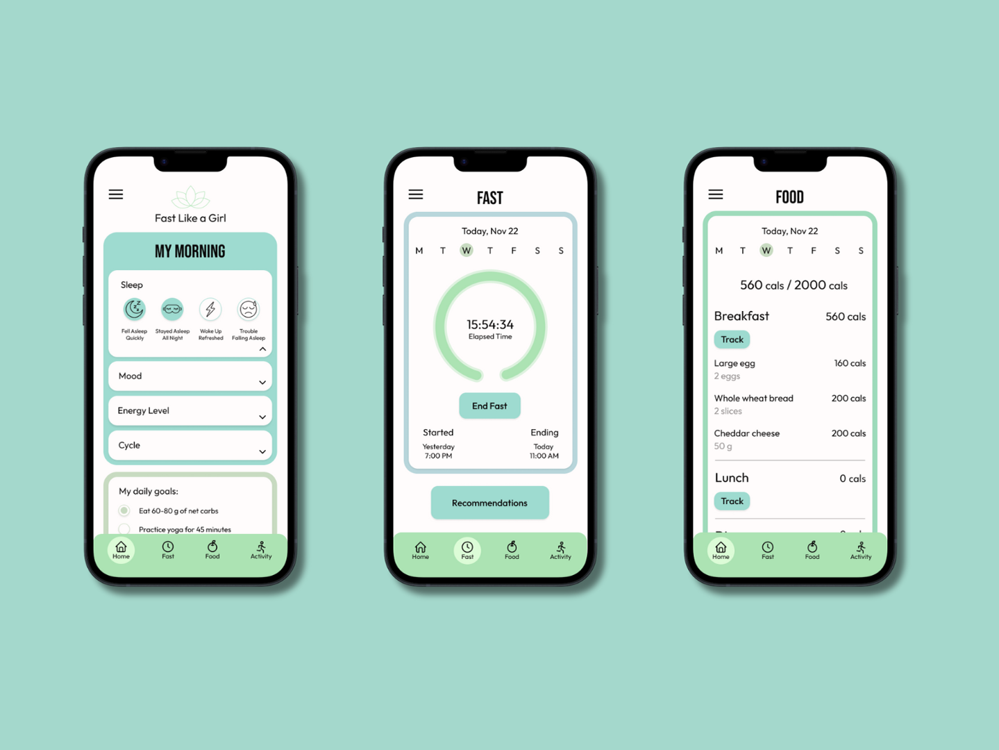
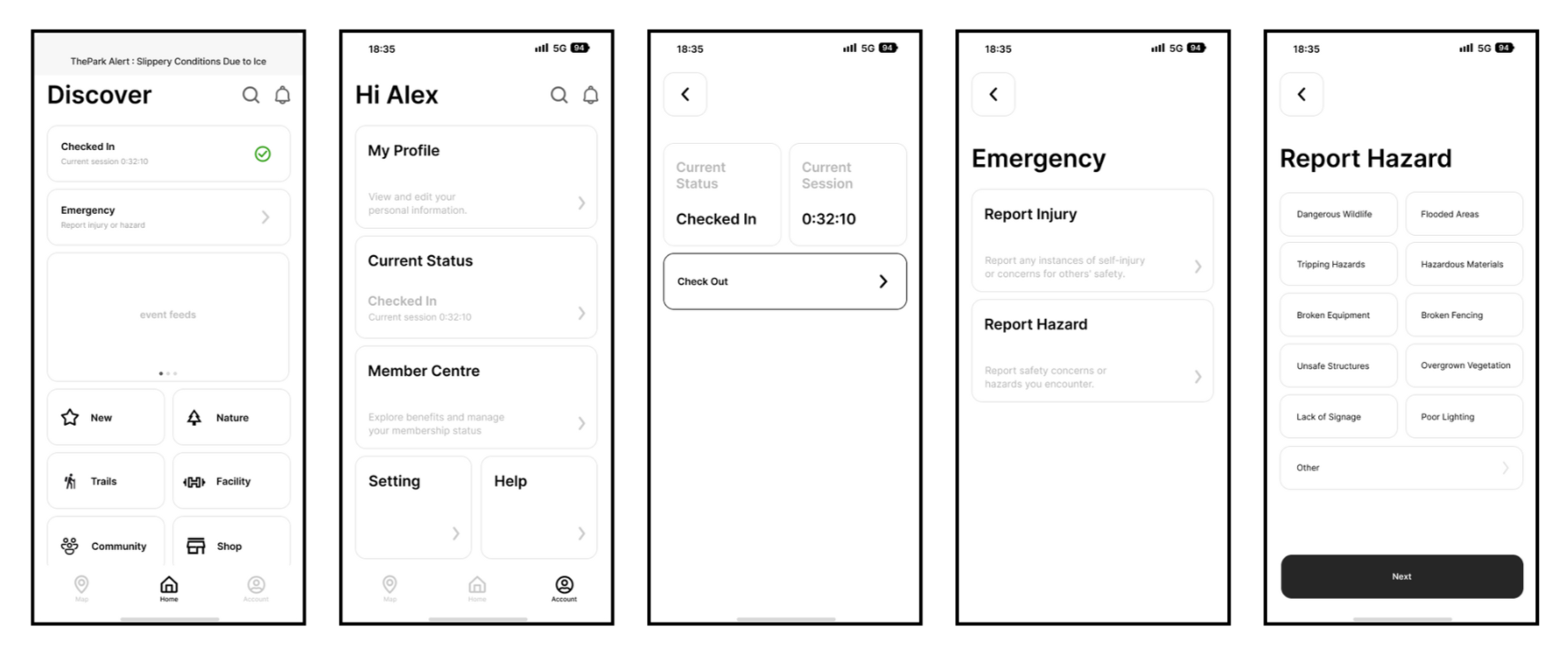
Wireframes V2
User Testing & Iterations
Prior to conducting user testing, we used the DECIDE framework to formulate our test plan. We then proceeded to do two rounds of user tests.
User Testing
What's Working Well:
- All participants who completed the finding a trail task found it to be an intuitive process
- Participants found the map feature easy to use and that it was similar to Google Maps
- Participants found the purchasing a membership task straightforward
What's Not Working Well:
- Multiple participants were confused by the “Check In/Out” buttons
- A participant was not aware that the trail section was clickable in order to learn more information
- In the Report Hazard/Injury section, multiple users noted that they wanted to be able to add more information about the hazard/injury or be able to call someone directly
- One participant noted that there should be more information about the different membership plans
- Other attendees should be able to see reported hazards, not just Park Rangers.
Iterations
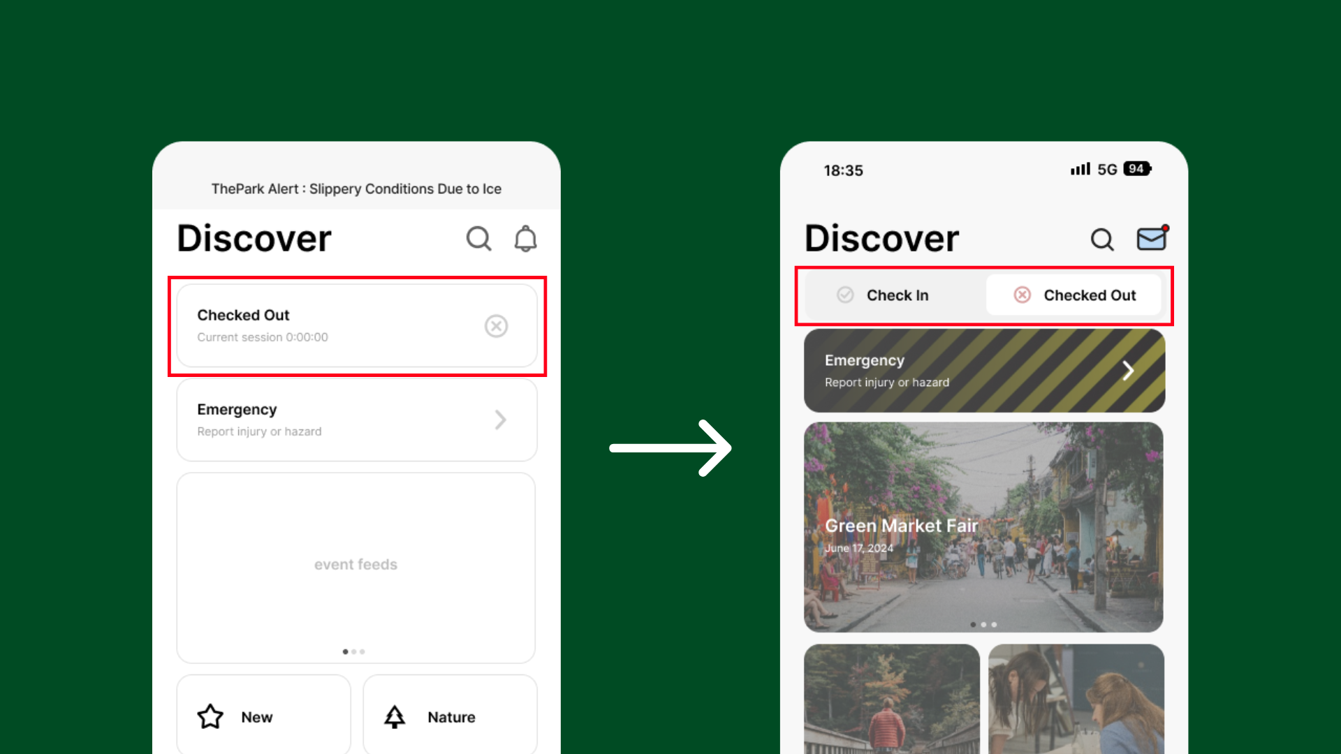
Feature: Checking In/Out
Feedback:
Multiple participants were confused by the “Check In/Out” buttons, as you have to select the button that says "Checked Out" to check-in.
Changes:
We replaced the single button with a toggle switch featuring two options. Additionally, we introduced colour for visual guidance.
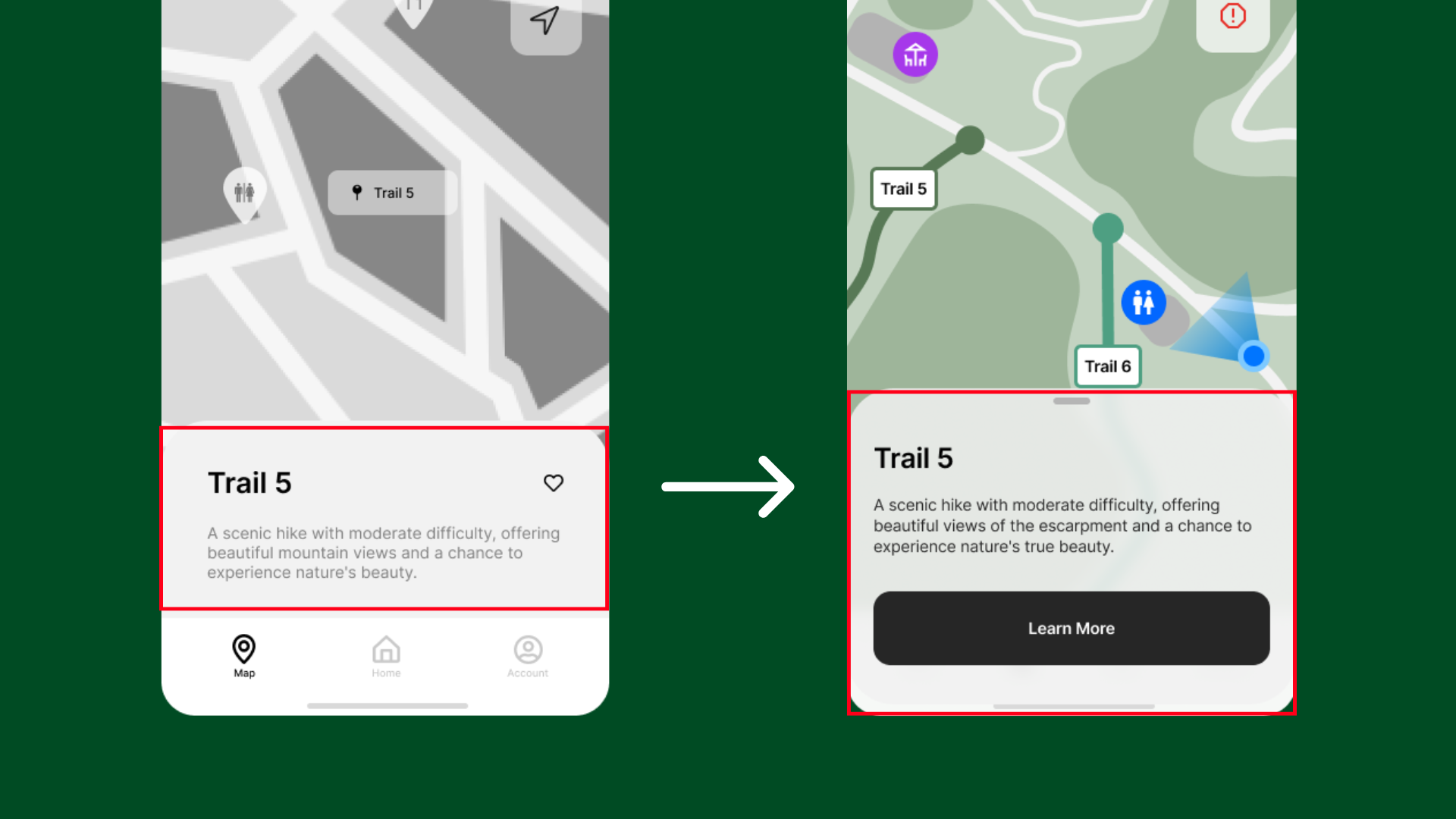
Feature: Trail Information
Feedback:
Users did not realize they could click on the trail overlay to learn more about the trail they had selected.
Changes:
We incorporated a "Learn More" button to ensure users could easily identify and access additional information.
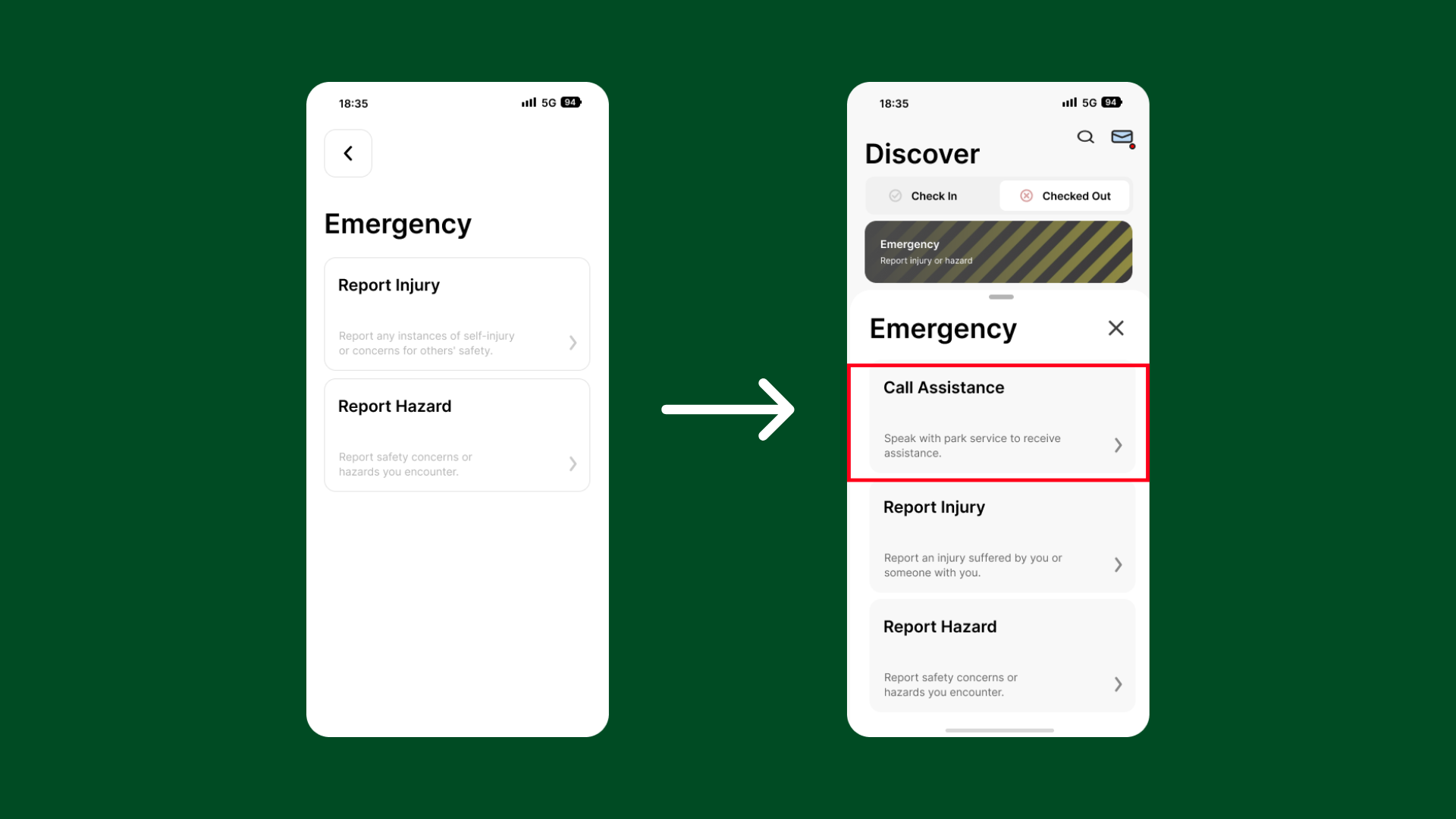
Feature: Emergency
Feedback:
Numerous users expressed the need for a direct emergency calling feature to reach ThePark staff immediately.
Changes:
We included the "Call Assistance" button, providing visitors with the choice to directly call for help if needed.
FINAL THOUGHTS
I felt a mix of excitement and a bit of nervousness diving into this capstone project. It offered my team and I a unique opportunity to develop a project from start to finish — from interviewing users, understanding their requirements, crafting a solution to meet those needs, and finally, undergoing testing and iterative refinement.
Although every stage of this project offered valuable insights, user testing proved especially enlightening. Putting our prototype in front of unbiased third parties underscored the reality that not all instructions are inherently clear, highlighting the diverse ways in which people think and process information.
I feel fortunate to have been a member of such an outstanding team. Our communication was excellent, and we approached our roles and responsibilities with dedication. We prioritized establishing processes and setting goals to keep us aligned and on target.
All in all, I'm incredibly proud of both my team and the digital product we've developed!